I previously built a visualization of the U.S. medical graph using the DocGraph dataset. The visualization prompted me to ask the question, does the state where you live affect the likelihood you will be referred to a doctor in another state?
Using the full DocGraph dataset I was able to answer this question; in short North Carolina had the highest percentage of patients referred out-of-state with ~ 28% of referrals going out of state. Michigan and California had the lowest percent with only ~10% of referrals going out of state.
In the remainder of this post I shall describe the process I used to obtain these result and provide a more detailed look at the impact state has on probability of inter-state referrals.
The first step in the analysis was joining the DocGraph referral graph with the National Provider Identifier database. By joining DocGraph with the NPI database I was able to determine the state of the referring physician as well as the state of the physician the patient was being referred to. After augmenting the DocGraph with this additional information it was simply a matter of aggregating referrals grouped by state. Once aggregated I had a state to state adjacency matrix which could be further aggregated to generate the graphs shows below.
For details on reproducing this analysis and all the code used visit Github. There are also some limitations to this analysis that are described in the footnotes 1.
Below is a choropleth map representing the percent of patients that were referred outside of the state. As you can see North Carolina, Pennsylvania have the highest percent out-of-state referrals. There is also an area of increased out-of-state referrals in the mountain region.
Click on any of the images below to see a full size version

A complement to the above image is shown below; The color represents the percent of patients that are referred within the same state. As you would expect the larger states such as California, Texas, and New York have the highest percentage of patients referred within the same state.
For those readers who want more detail on the statistical distributions of state level referrals you can find kernel density estimate plots in the footnotes 2.
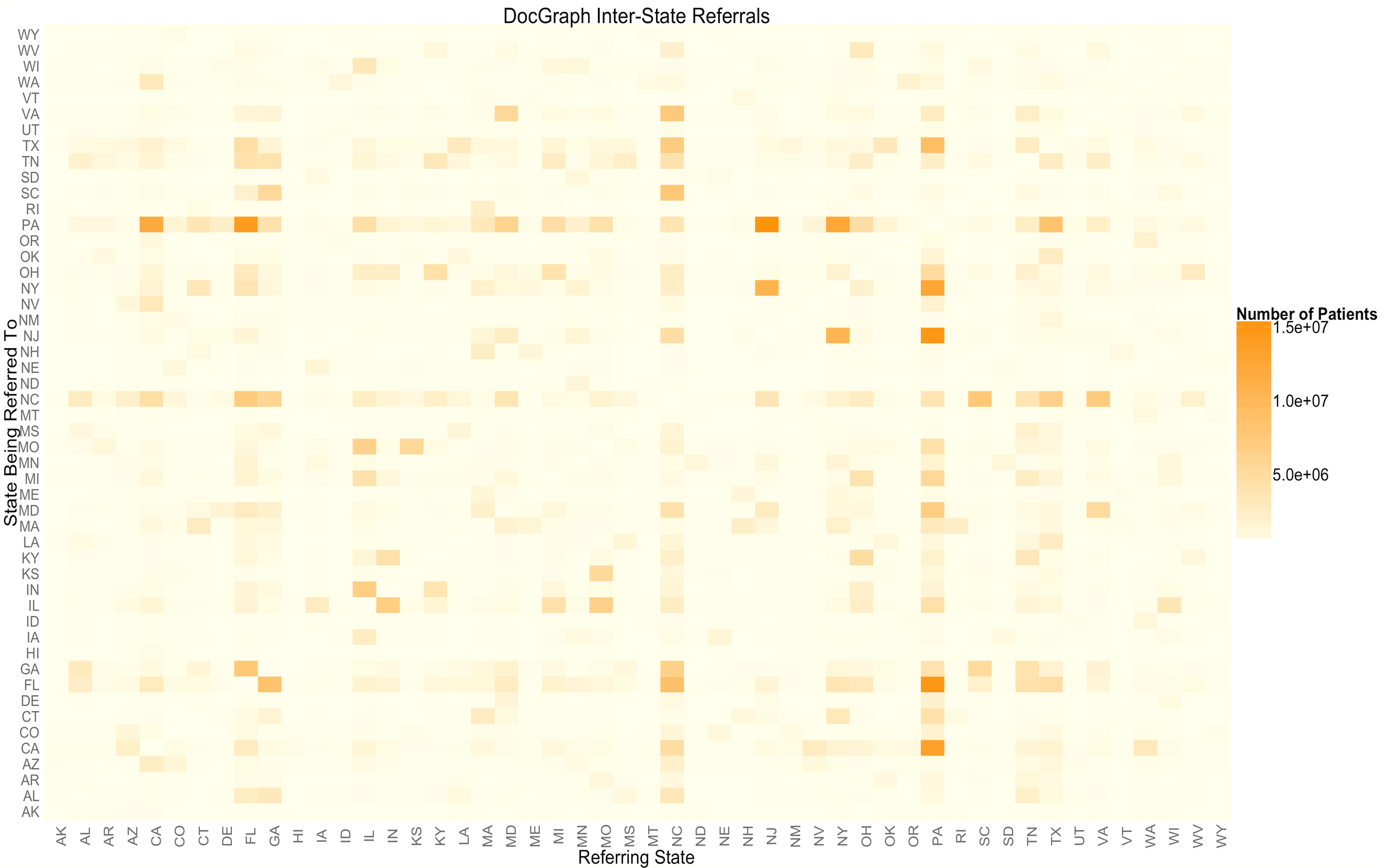
After analyzing the probability of inter-referrals I got curious where all these out-of-state referrals were going. As a first step towards understanding out-of-state referrals I assembled a heat map. This heat map provides some details on which states patients are being referred to. Each square in the heat map represents an entry in the state to state adjacency matrix contained in the DocGraph network.
The results above should have provide a good answer to the question of the impact of state on likelihood of out-of-state referrals. In addition we can get an idea of which states have the most inter-state referral traffic. Overall I think this analysis brings us one step closer to unlocking the potential of the DocGraph data to help us understand the U.S. health graph 1.
I hope you have enjoyed my analysis. I am always open to feedback and would love to collaborate on some research related to analyzing the DocGraph data set. If you are interested in collaborating on research related to DocGraph please email me ryan [at] weald.com or message me on twitter @rweald
Footnotes
There are a couple of important limitations of the data to remember when interpreting this analysis. The DocGraph data set only includes data from 2011; we can assume that physician behavior is much the same today as it was in 2011, however without a sample from some other time period we can not be sure. Secondly, DocGraph only represents Medicare referrals which may not be representative of the entire healthcare system. Unfortunately a more comprehensive dataset including private referrals is not available to me at this time. Therefore, the DocGraph dataset is the best referral sample I could get as a private citizen.
2.

