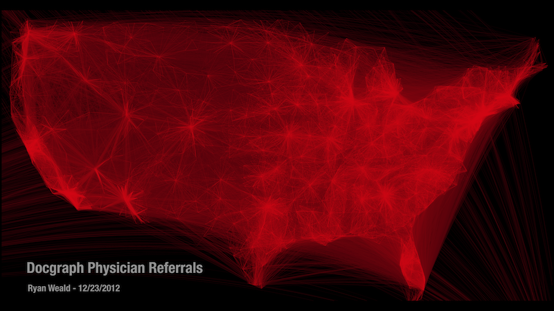
I recently acquired access to the DocGraph data set on MedStartr. This data set contains a social network of U.S. doctors, with each connection representing a physician referring a patient to another physician. Given this new unique data I thought it would be interesting to investigate the geographic connections between doctors. What better way to start analyzing the data than to make a sexy visualization.
To create the final visualization I had to combine multiple data sets to enrich the doctor social graph with geographic coordinates. I began by taking a sample of 1 million connections from DocGraph and joining it with the National Provider Identifier (NPI) database. By joining these two data sets I was able to get the zip code of each physicians practice. The final step was converting the zip codes to latitude-longitude coordinates using a publicly available zip code database. Now that the data was in the correct format I began work on the visualization.
The visualization I choose was heavily inspired by the great work of Paul Butler at Facebook.
Using a similar method to the one documented in Nathan Yau’s tutorial I graphed the connections between physicians using great circles. In order to see the cluster density I layered the connections using Euclidean distance, with the longest paths being drawn first. All of the code used to generate this visualization is open source and can be found on Github
Below is the resulting visualization. Note the areas of high and low density as you move from the east coast over to the west coast. There are also some interesting connections from Hawaii and Puerto Rico to the Continental United States.
You can download the full sized graphic here. I recommend you right-click and “save link as” because the file is approximately 40MB.
This visualization is only the beginning. The added feature of geography opens the door to many interesting analyses. I would love to collaborate on some research related to analyzing the DocGraph data set. If you are interested in collaborating on research related to DocGraph please email me ryan [at] weald.com or message me on twitter @rweald
